Scott Grant
Creative Design Level 2

Portrait
Medieval helmets are things that I have a fascination with, and because I didn't use a photo of myself I decided to represent myself with a helmet.
This was done by modifying an image of a helmet from Google using Adobe Illustrator's Image Trace. The original image had a fake checkerboard background, and when using the Trace it became a solid colour before becoming its checkerboard when there were high enough colours available, making me choose about 5 and adding about 3 more after.
Using the Vectors of the image I used them to try and cover white spots that weren't given interesting colours, before using a brush to make the white appear as if they were reflections.
All of the opacity was 100% and 5 of the colours were done through Fills.
Most of the Pink lines were 3"pt", but to add variety where I could I'd make certain parts a smaller size, with one point being 0.75.
Parts that were added later had different sizes depending on what they were used for. Some of the grey around the white spots were 0.25 to fit and not be obnoxiously big, the black area was 1 pt due to it being large with all but one of the grey dots being 1.5 to be viewable, the other being just 1 pt due to distance.


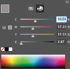
Colours
These are the colours I used on the portrait

Used for the pink lines

Used for the black/eye area and the breathing holes

Used for the darkest grey area

Used for the second darkest grey area

Used for the grey dots in the black
Used for the grey area between the black

Used for the reflection-esque area

Used for the grey around the reflection-esque area

Used for the background.
Layering
For safety I had the image I traced and all the editions I added kept seperately on different layers.
Layer 1 contains the traced image and is blue
Layer 2 has the additions and is red

----------------------------------------------------------
Pen Tool In Illustrator Test
This was a test in using the Pen Tool within Adobe Illustrator. We were told to find the image of an animal and then to trace over it with the pen tool.
Originally the image was larger and I was planning to go over the whole image, however some reasons changed that.
1) The paper size chosen and the image size didn't correlate well.
2) It was simply too big, and I assumed that I wouldn't have enough time to do it entirely.


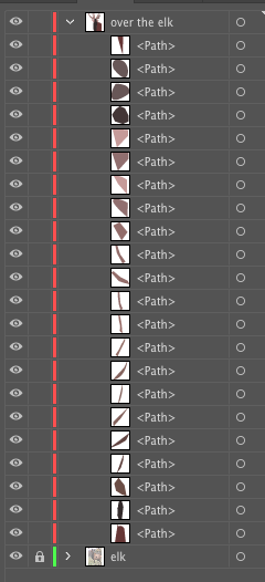
Layering & Colour
Along side being used to learn about the pen tool, this workshop taught layering in this style.
The use of layering allowed me to place different parts behind or in front of others, to emulate depth
Colours were picked to add more to the depth, with lighter images being more in front with darker colours generally being further away.
All colours were kept to a more brown colour scheme, due to the original Elk's colours being a similar shade. The red colour was done due to time and there being already a large amount of colours.
----------------------------------------------------------
TYPOGRAPHY

Text before being modified

Layers
Here we were tasked to create a logo with our initials.
This was done on Adobe Illustrate, we first wrote the initials with the text tool, and duplicated it just for safety, next we were told to search for fonts that were interesting, lastly we had to separate the letters by using the Properties menu, pressing Create Outlines, and then Ungroup. This allowed us to move the letters.
For me I decided to have a design that would mix the S and the G together.
First I decided to give them different colours to differentiate between them, so I had G with a pink outline and S with a green outline.
To add more differences I decided to lower the opacity of the G so that it doesn't cover too much of the S.
Settings of the G


Settings of the S
----------------------------------------------------------

Photoshop Composition
In order to learn Photoshop we created a composition of multiple images found on Google, then lowering opacity and play with the colours.
Previously we had to create a portrait for our composition, however due to difficulties with me not liking to have pictures of myself I decided to use the picture of a helmet that was also used in the portrait with Illustrator.
But there was instead troubles because I was too ambitious, trying something too complex and ended up not having enough time to do it correctly.
This image was made as a quick fill-in for the lack of a portrait, my instant first thought was using pictures of water, ice, and electricity.

The Layers
Due to being one of my first pieces of work, being rushed, and technical issues, there are no more available images of the process
----------------------------------------------------------
Distorting & Transforming Shapes

Stars

Polygon
Using tools that create shapes (Star Tool, Polygon Tool, Eclipse Tool) we used several tools in order to distort and manipulate the shapes.
And in order for there to be variety we were told to give each shape a different colour.
And later on we were told to make something that was "like a face" which is what the worm/tadpole thing in Polygon was made for. The brown star in Star looked naturally like a head so I decided to add some eyes via the paint brush.
There was also a moment of distorting text but I didn't know that and missed it.

All of the chosen Tools
Eclipse
----------------------------------------------------------

PUMPKIN
Due to it being October, and because we had been doing so much work, we were told to try carving our own pumpkins, either using pre-existing images or sketching our own.
First part was emptying the inside, cutting out the top and then scooping out the internals into a bowl. This was for people who'd want to make the insides visible outside and have a light inside it, which I didn't do.
After that was the carving. Using tools we removed skin and 'meat' to create a style, usually of some kind of character.
I was no different, using Isaac from The Binding of Isaac, which contains a lot of horrifying imagery so it fitted with halloween, and there's even a moment with him wearing a candle on his head!
This was actually my first time touching and carving a pumpkin in over 10 years so I wasn't 100% confident in doing much. Originally I was going to have the mouth have teeth and possibly having the mouth see-through, but I worried that it'd collapse or create other issues, and the mouth was getting too big so I abandoned it.
However I can say that I'm happy with the final product, it's just right for what I wanted.
----------------------------------------------------------
Testing Adobe After Effect's Basic Tools

(I don't know how to export Adobe After Effects work into videos/gifs so I had to screenshot it)


To learn the basics of how Adobe After Effects we were told to limit what we used. First we used the shape tool, we weren't told about something like the brush tool, and the only movement parts we were told about were parts of Transformation, being Position and Rotation.
With one shape we move it to create a keyframe at the time selected, move to another time and then repeat, we were able to do this because we used Position.
Rotation is something I didn't use because I didn't fully understand it. When I did it the things I noticed were that the "0x" seemed to be how many rotations it goes through while the "0.0°" appears to be how far the rotation goes, but I'm not 100% sure. The rotation is very weird when you get it working, with it spinning extremely far and unpredictably so I have a feeling that the Anchor Point might be effecting it but I wasn't able to test it out.
Adobe After Effects is a tool that'll take a while to full comprehend and use, but when I know what to do with it then it'll be very useful.
The Layers used, if a watch is blue that means that it is activated.
The timeline, the blue vertical line shows the selected time and the white diamonds are Keyframes
